Email: info@racheljablonski.com Phone: 303.453.9395
Brand identity, illustration, layout, typography, package design, motion graphics

Brand Identity
The new logo aims to be clean, modern but also fun and playful like the brand. The bright, playful blue doesn’t take itself too seriously, also like the brand.
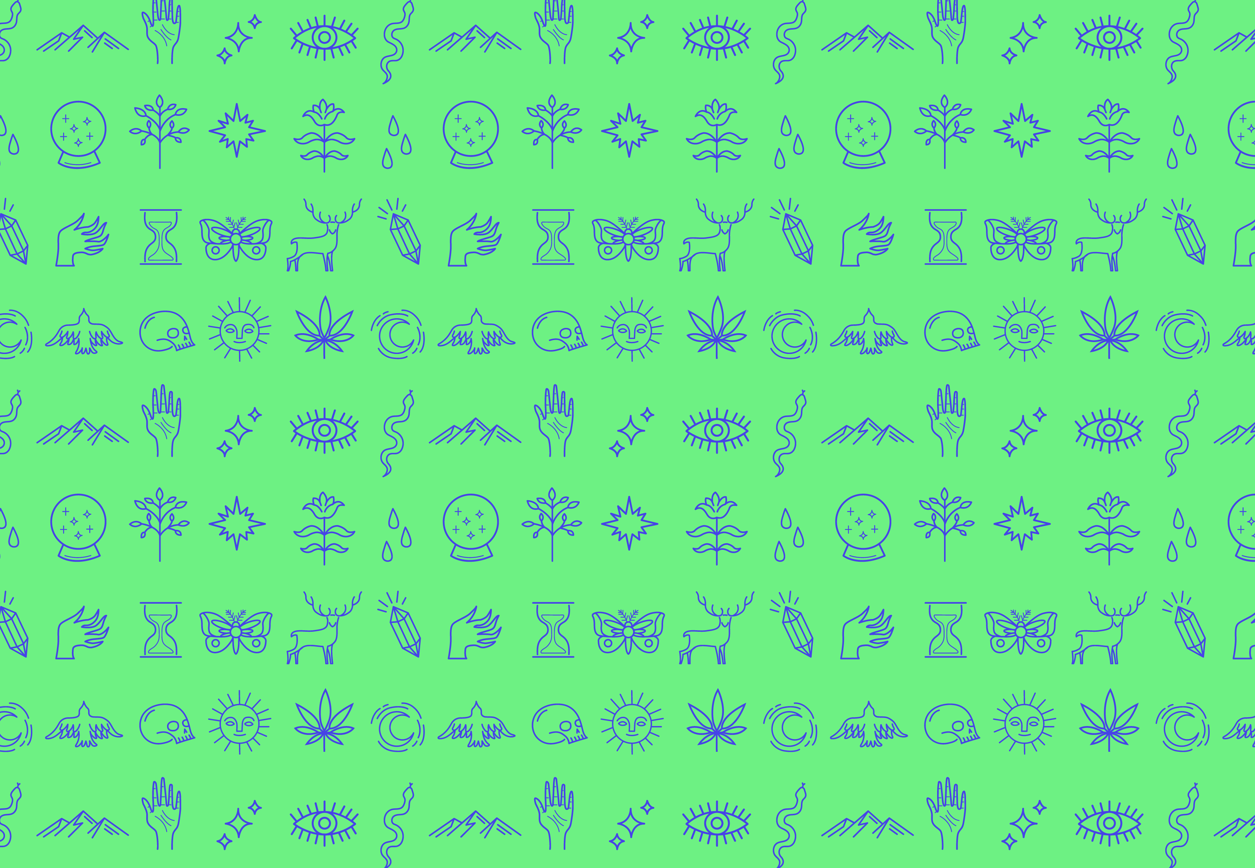
Icons and Pattern
I created a series of playful line icons that represented aspects of the company and the location of Native Roots in Colorado. The icons are meant to represent literal aspects of the brand, such as the pot leaf and mountains, but also figurative aspects of the brand, like the skull and crystal ball, to represent mystical properties of cannabis and the healing and calming aspects of cannabis.
Icons for Native Roots Branding
A pattern was created from the icons to be used on the packaging, website, and wallpaper for the stores.
Pattern created from icons
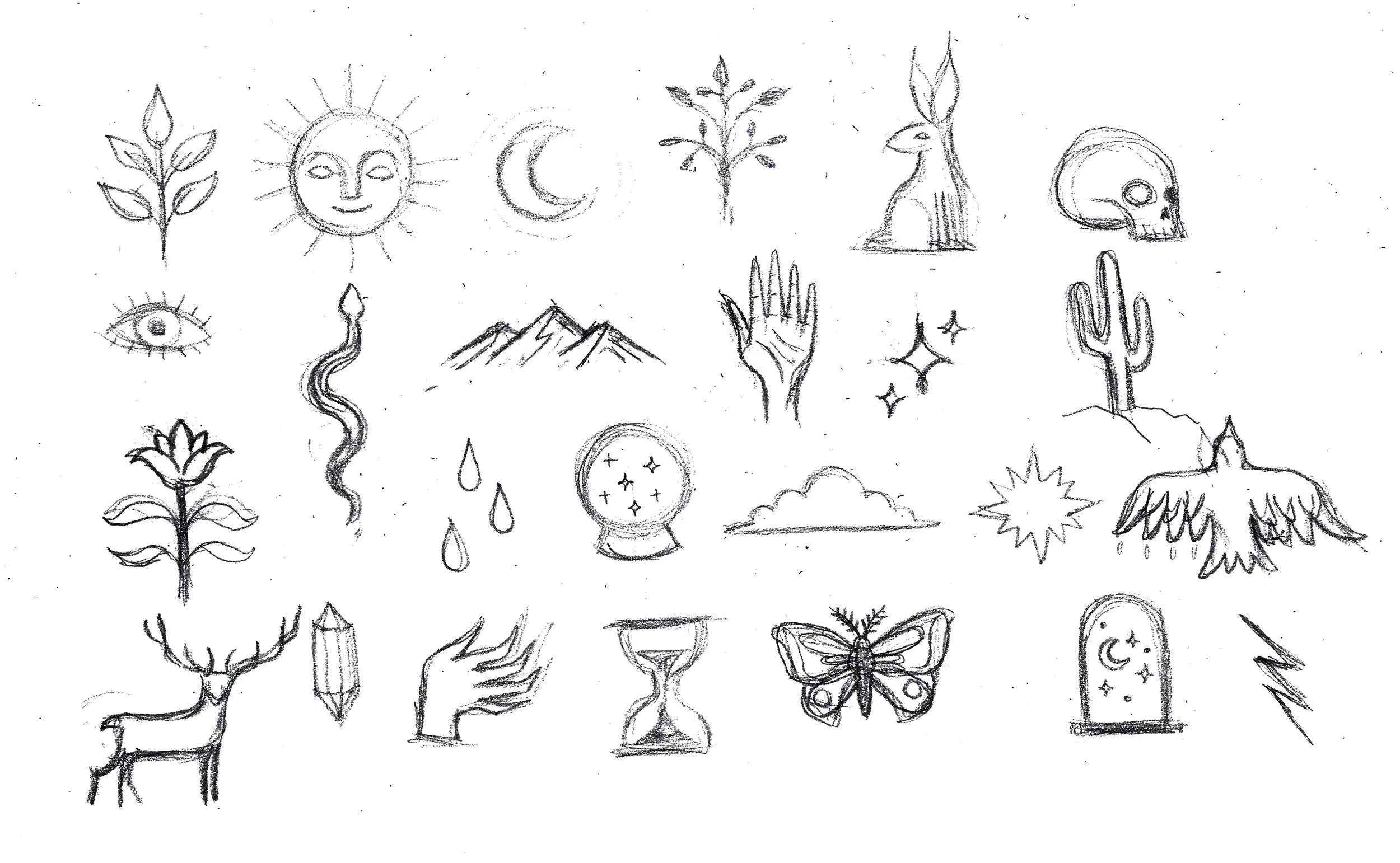
Sketches for icon designs and pattern
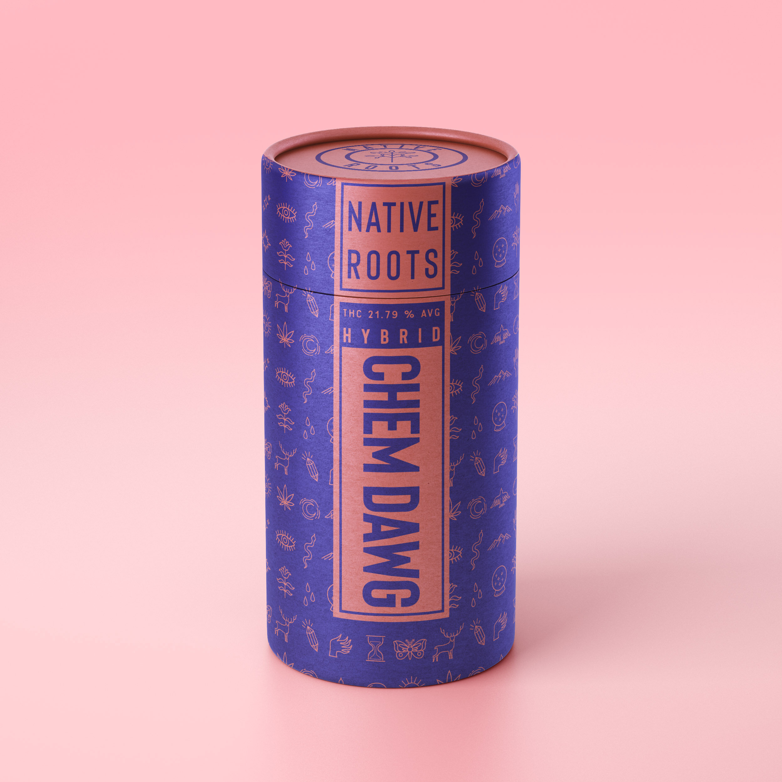
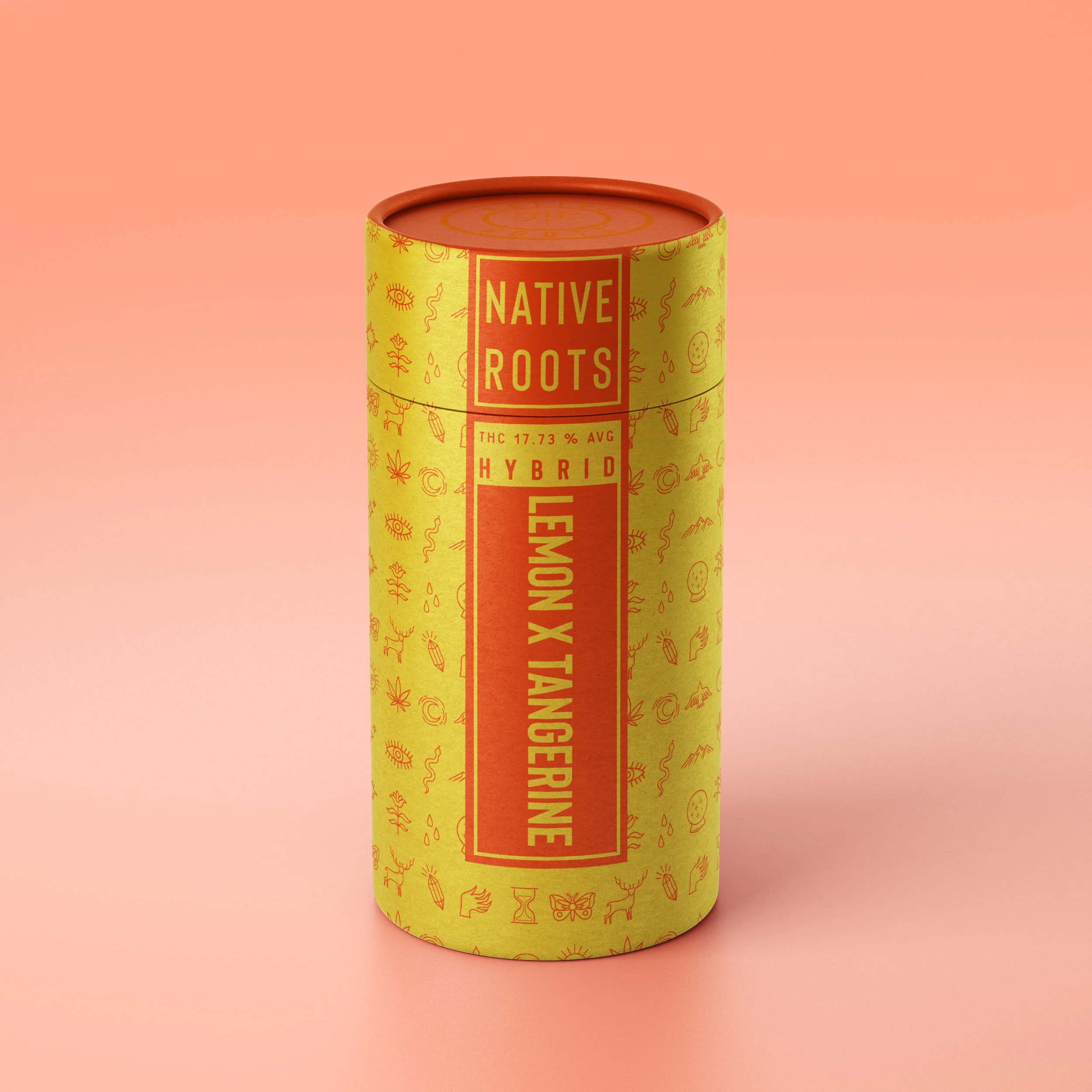
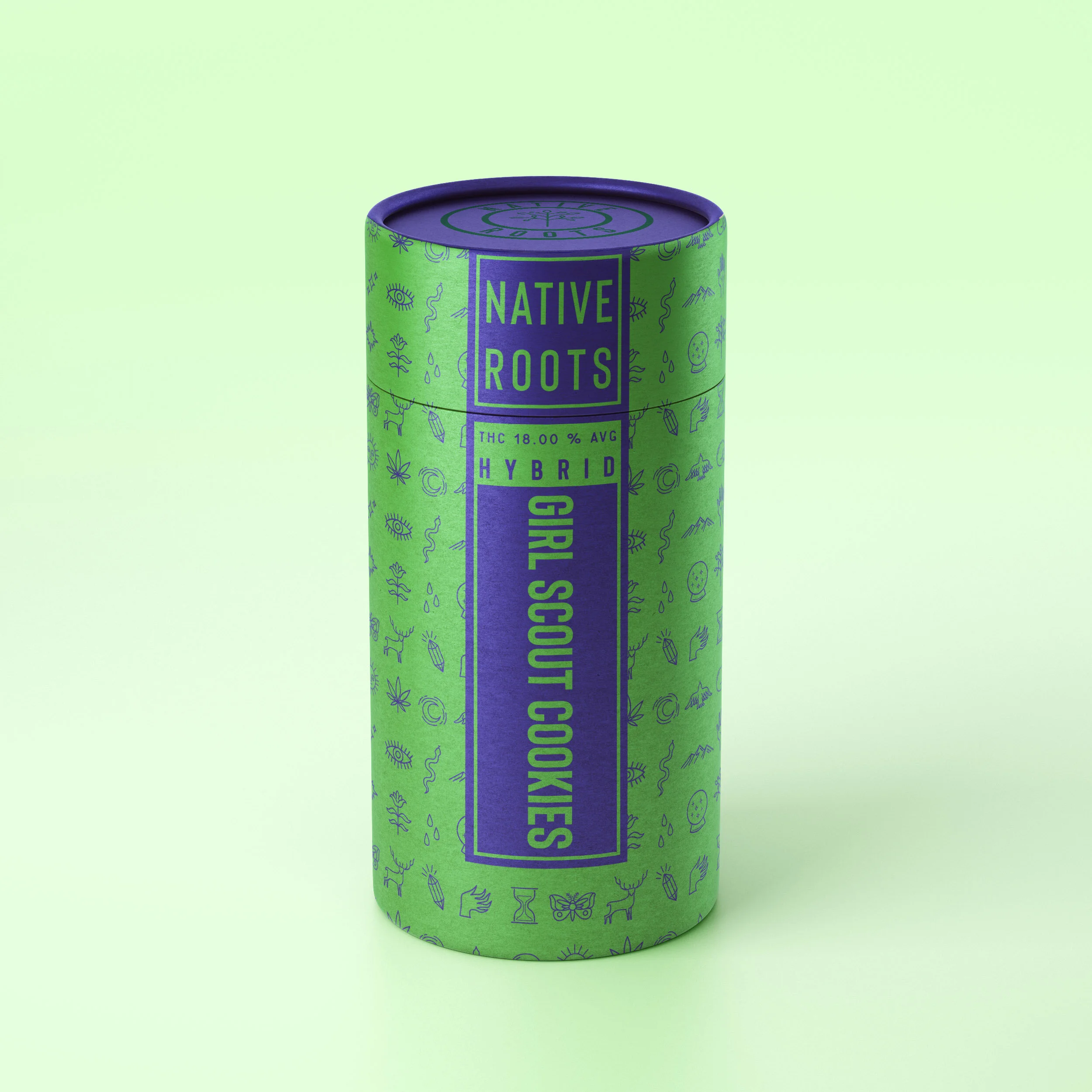
Packaging
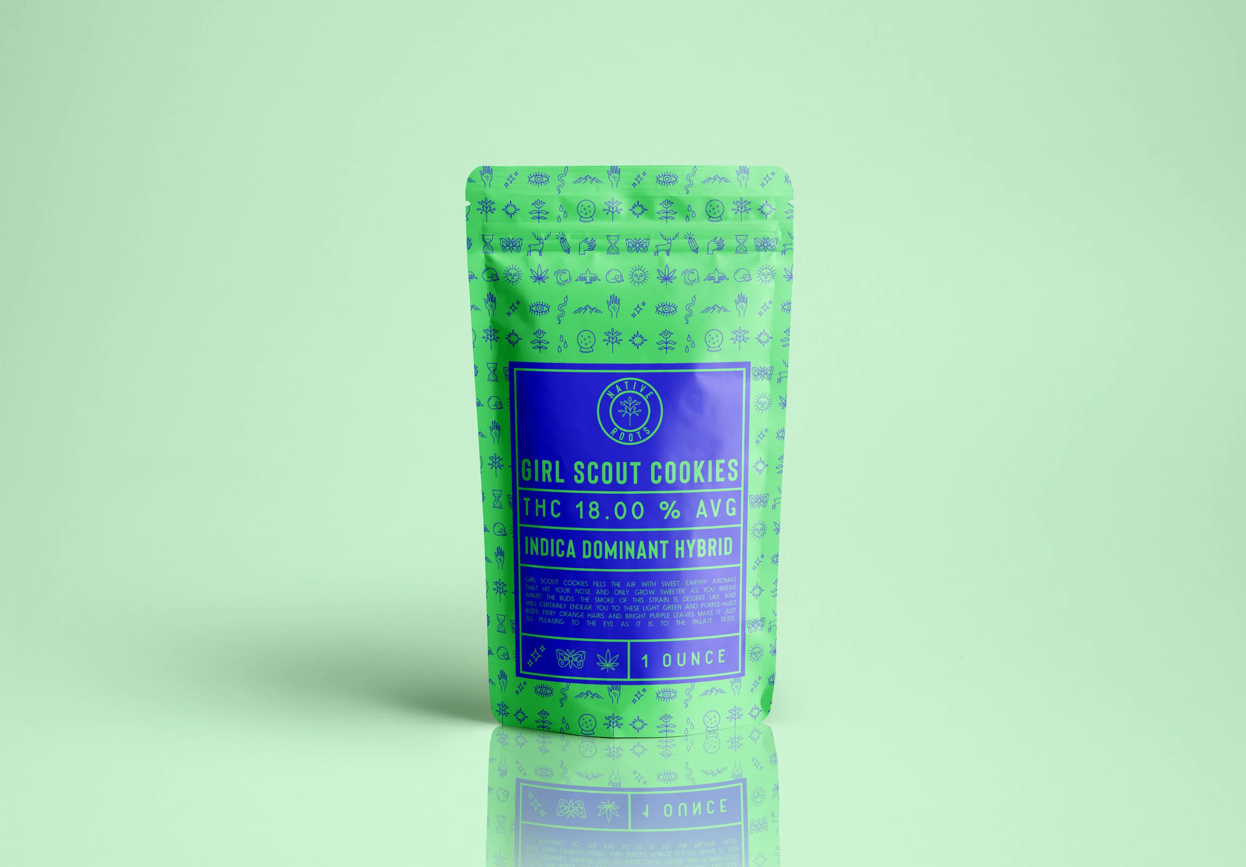
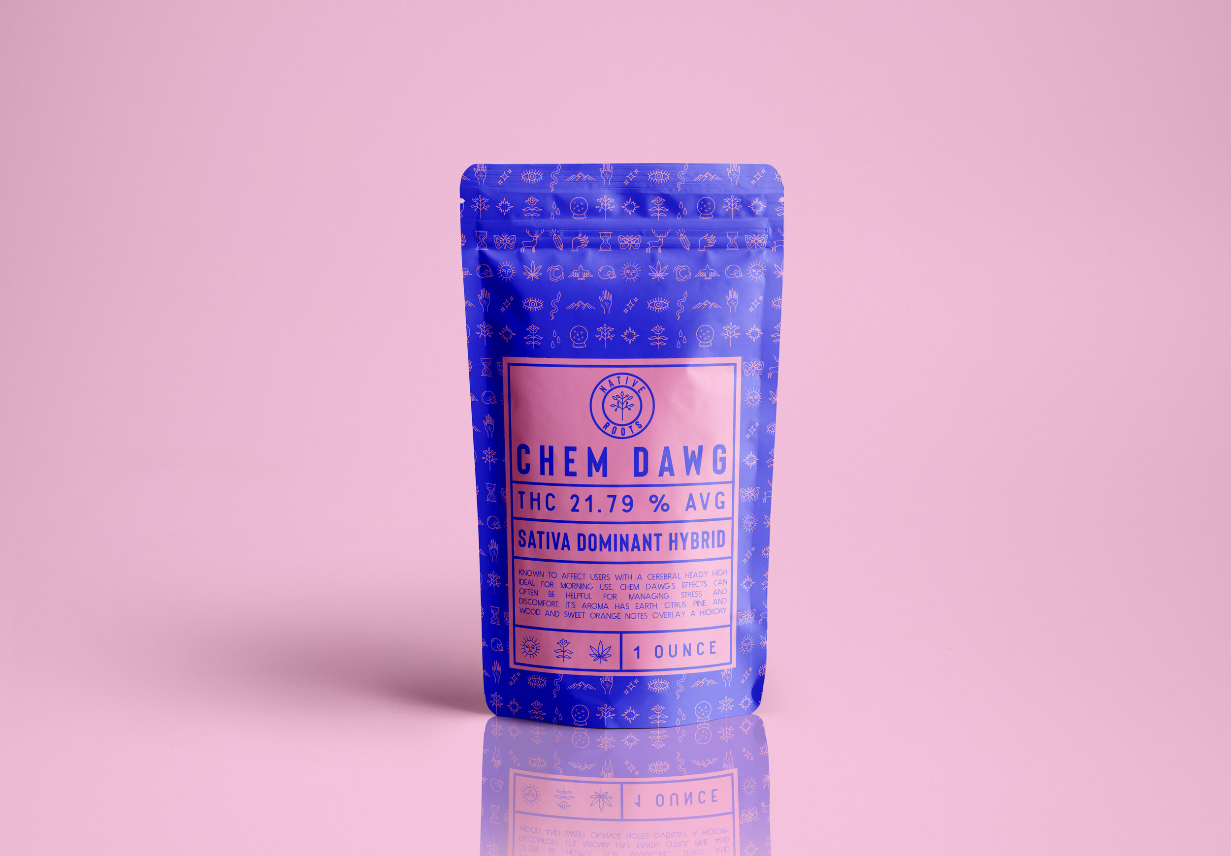
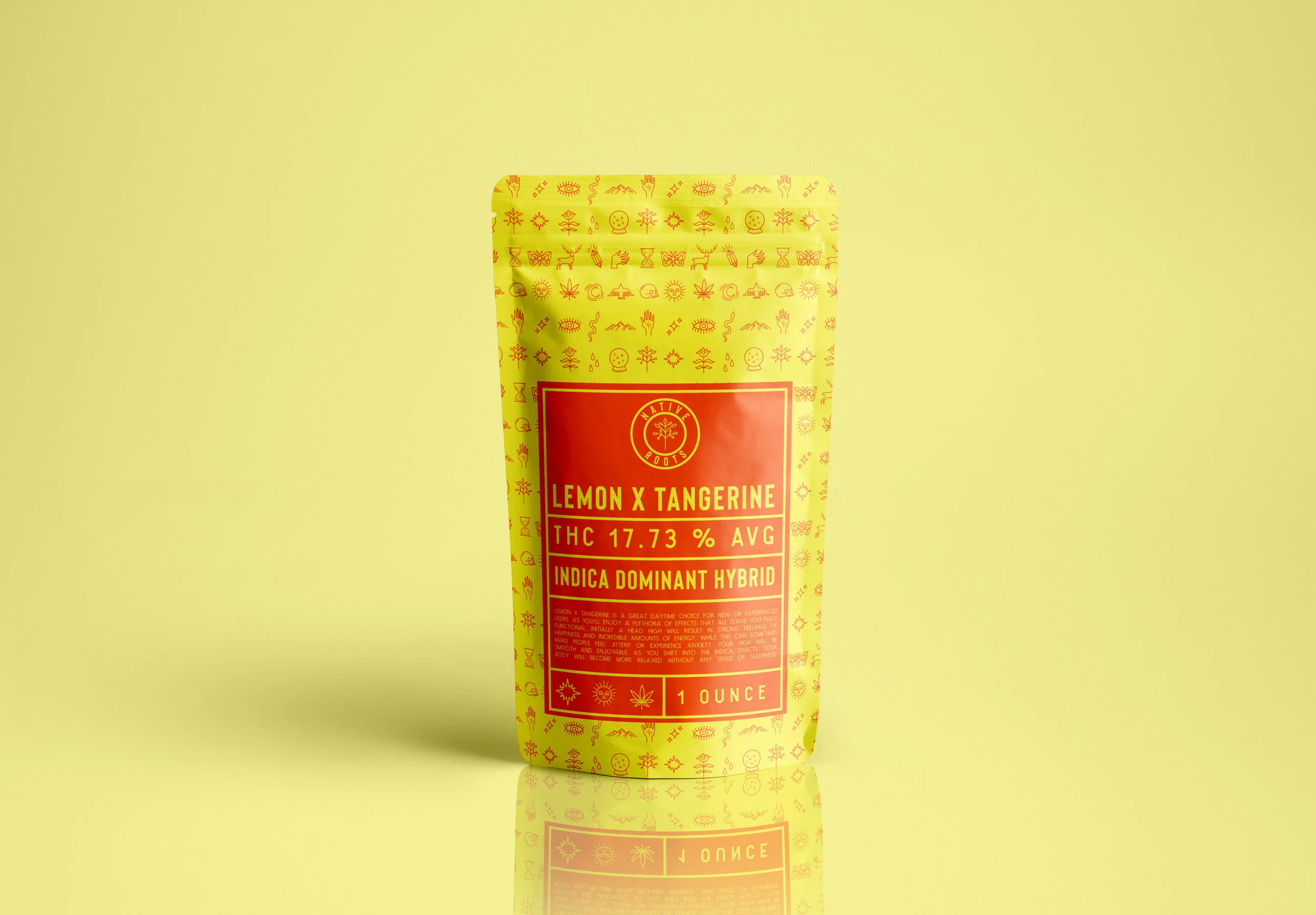
The packing for Native Root’s THC products are inspired by the brand’s fun and playful nature. I used colors that evoke a sense of child-like playfulness to represent the brand’s recreational nature and to make it stand out from the numerous dispensaries in Colorado. The colors also evoke the names of the product; eg. yellow and orange are used for Lemon X Tangerine etc.
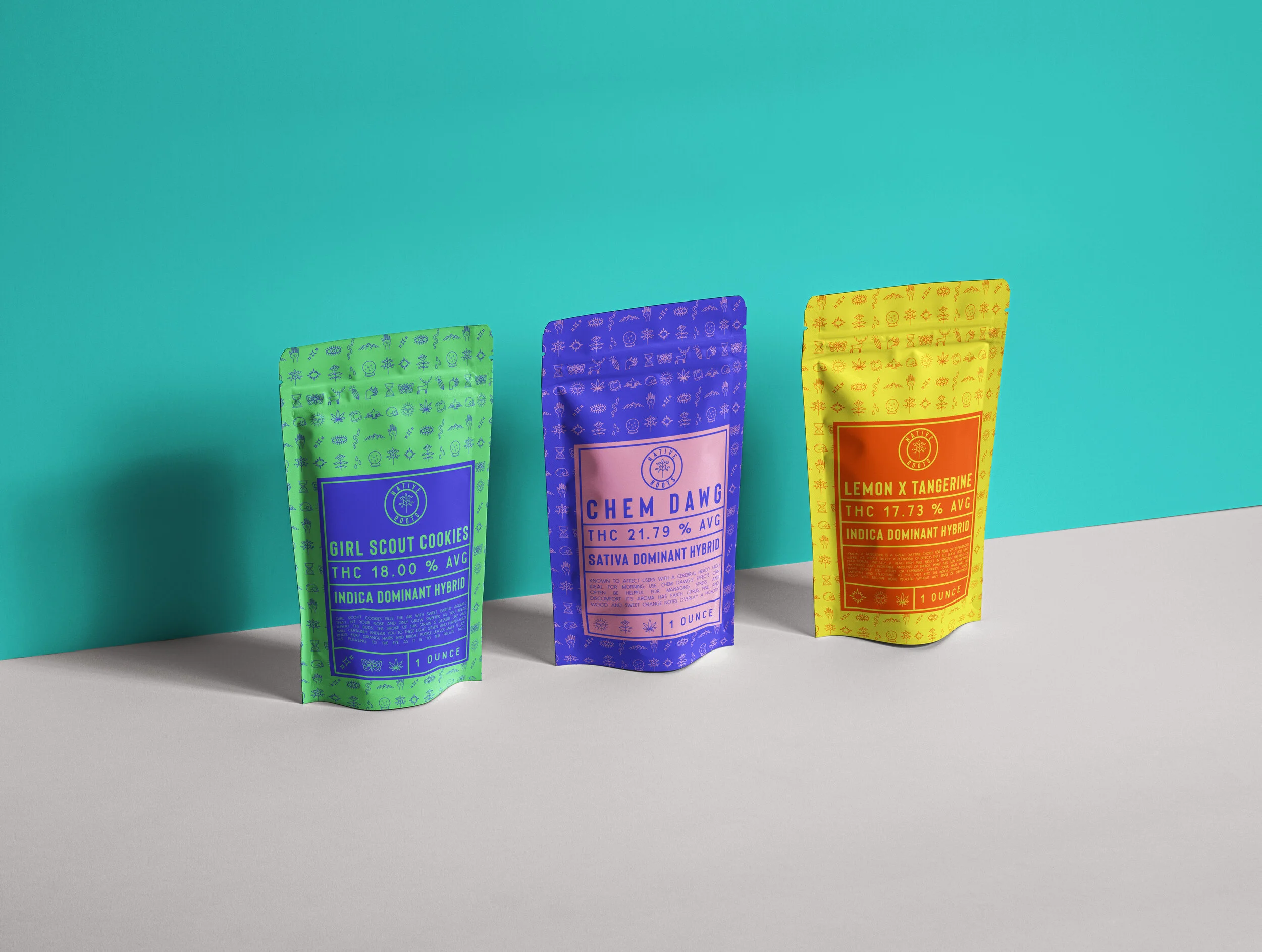
Sealed plastic pouches for THC product