Email: info@racheljablonski.com Phone: 303.453.9395
Brand Identity, packaging, logo, illustration, layout, typography
Brand Identity
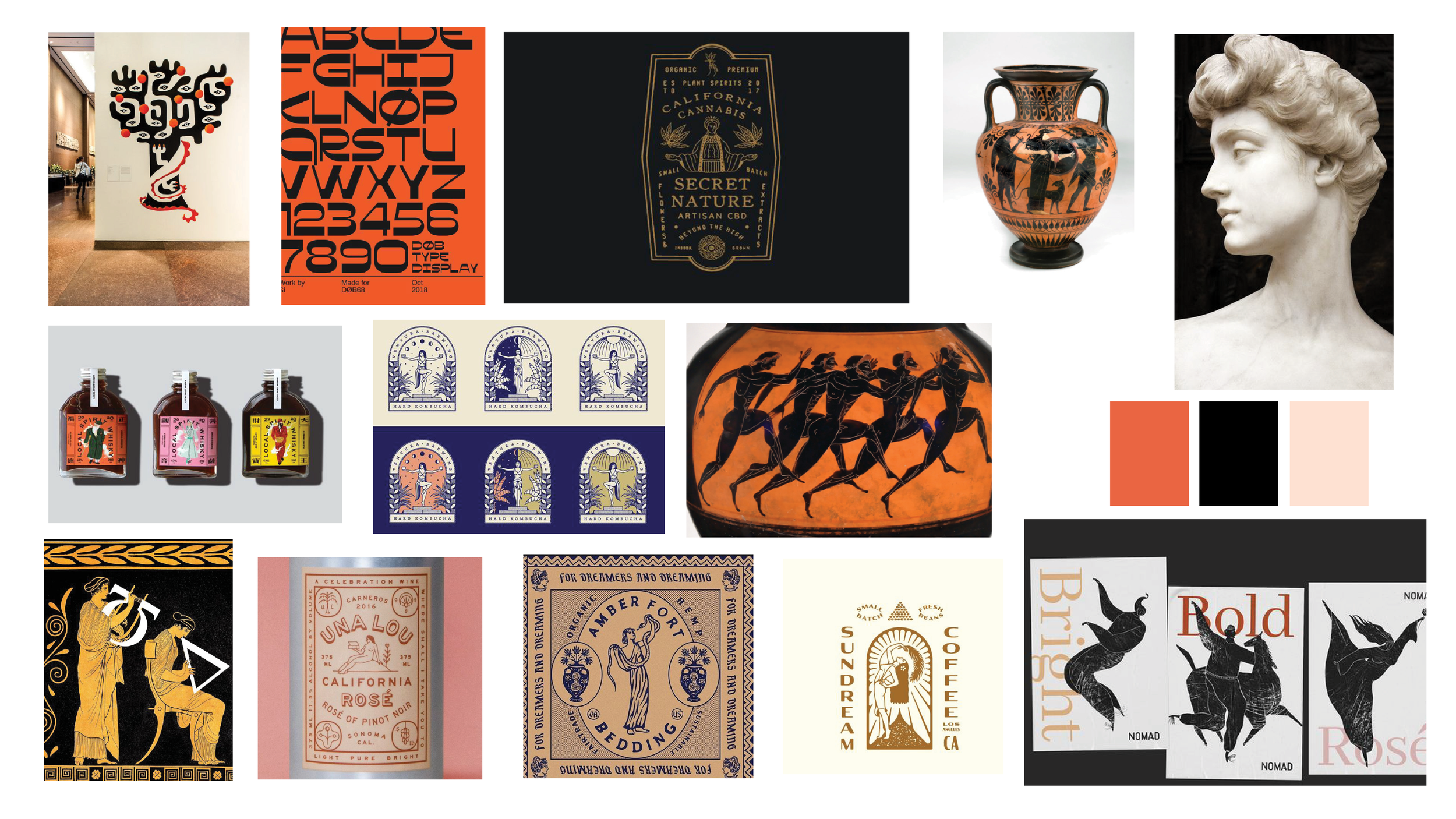
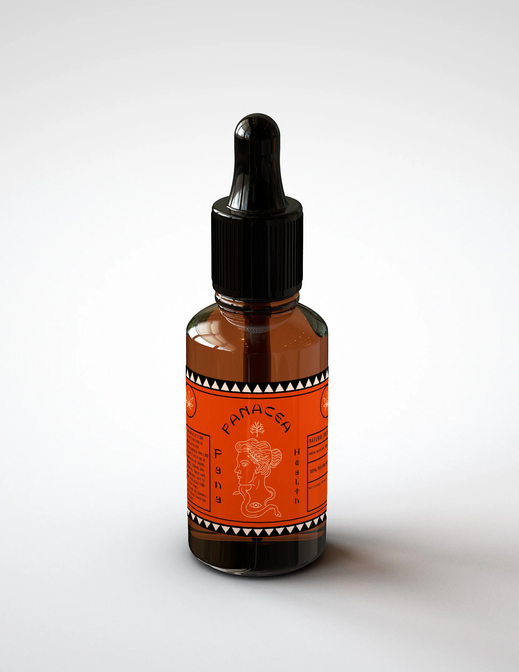
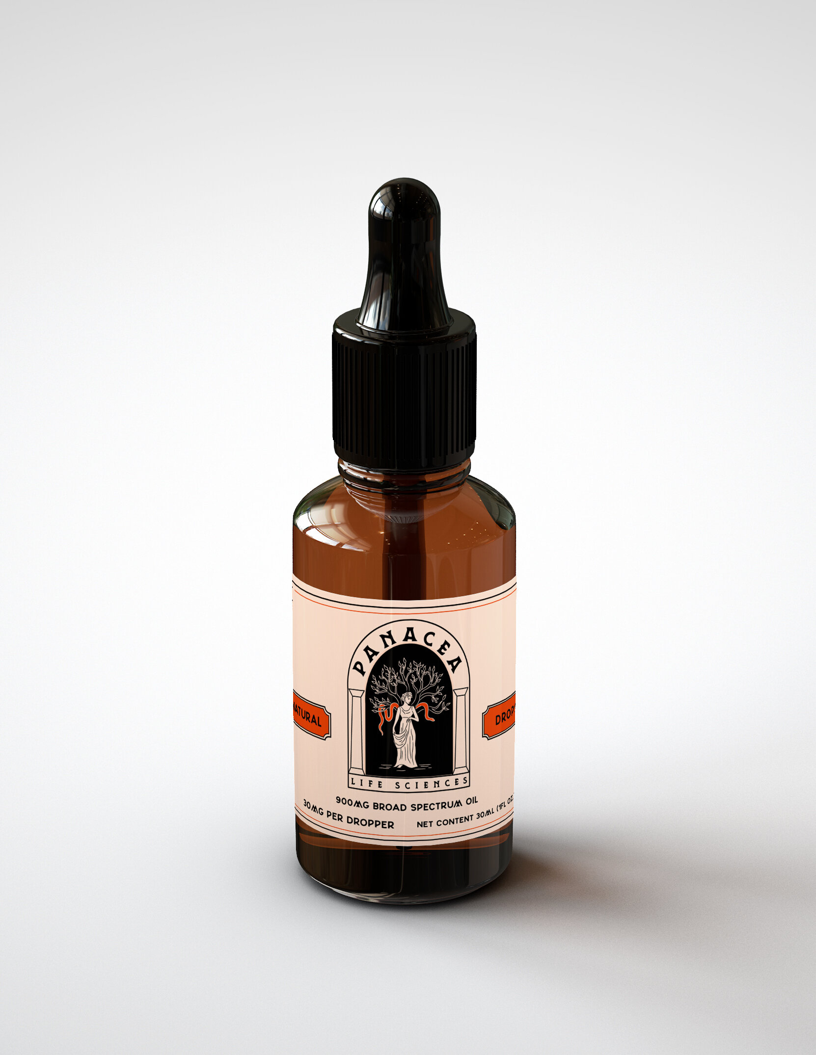
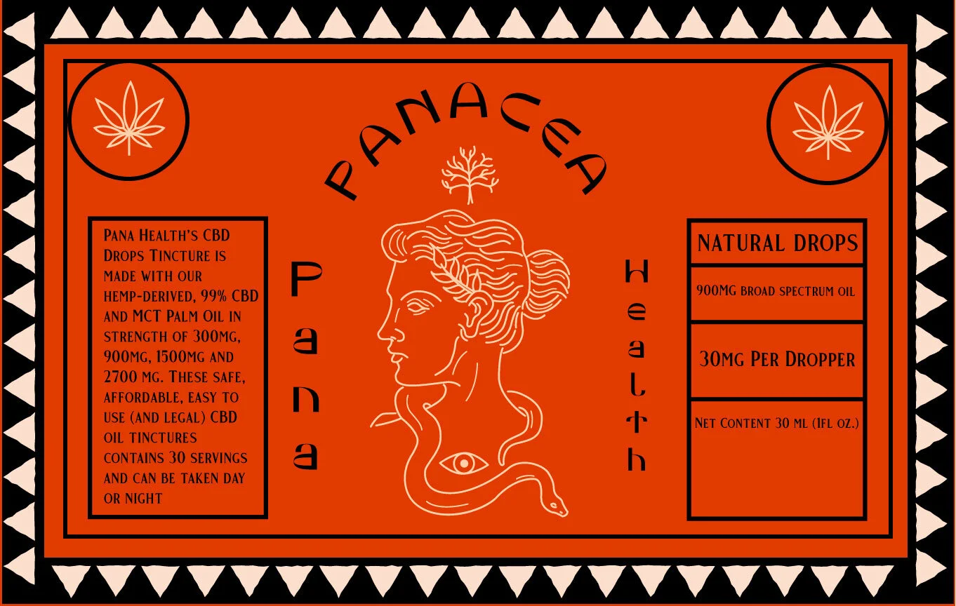
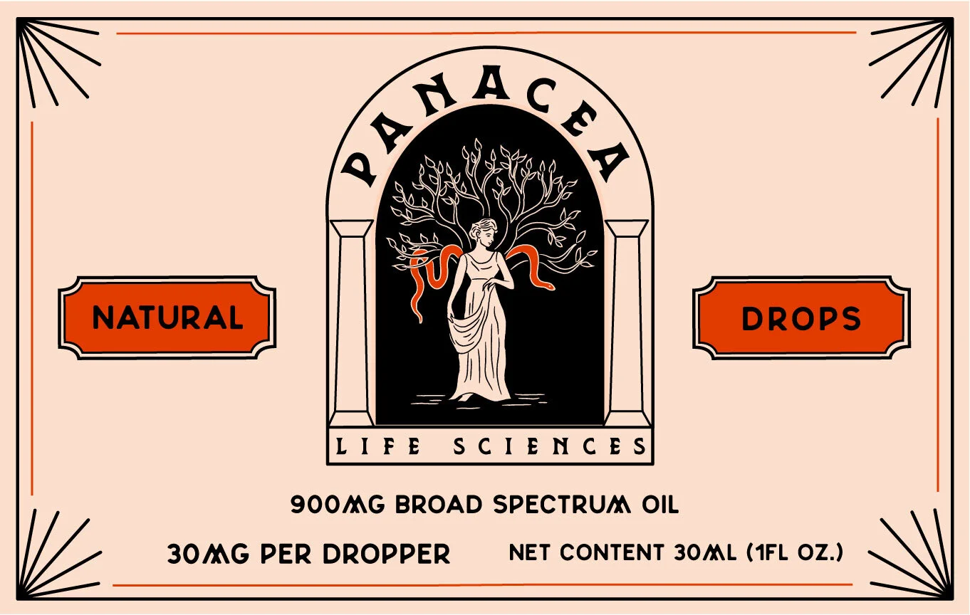
Panacea is a cbd oil brand dedicated to backing their products with proven science. As their company grows larger and they add more products, they wanted to give their company a facade that would appeal to the masses and exemplify their ideals. Their old label featured the goddess Panacea, the goddess of health and curing of ailments. Panacea wanted to keep their signature orange and the goddess idea but move away from the medical logo look. The new look and feel is a nod to an ancient remedy, recalling ancient Greek pottery and art to evoke a sense of wisdom.
Panacea’s old logo

Logo after rebrand
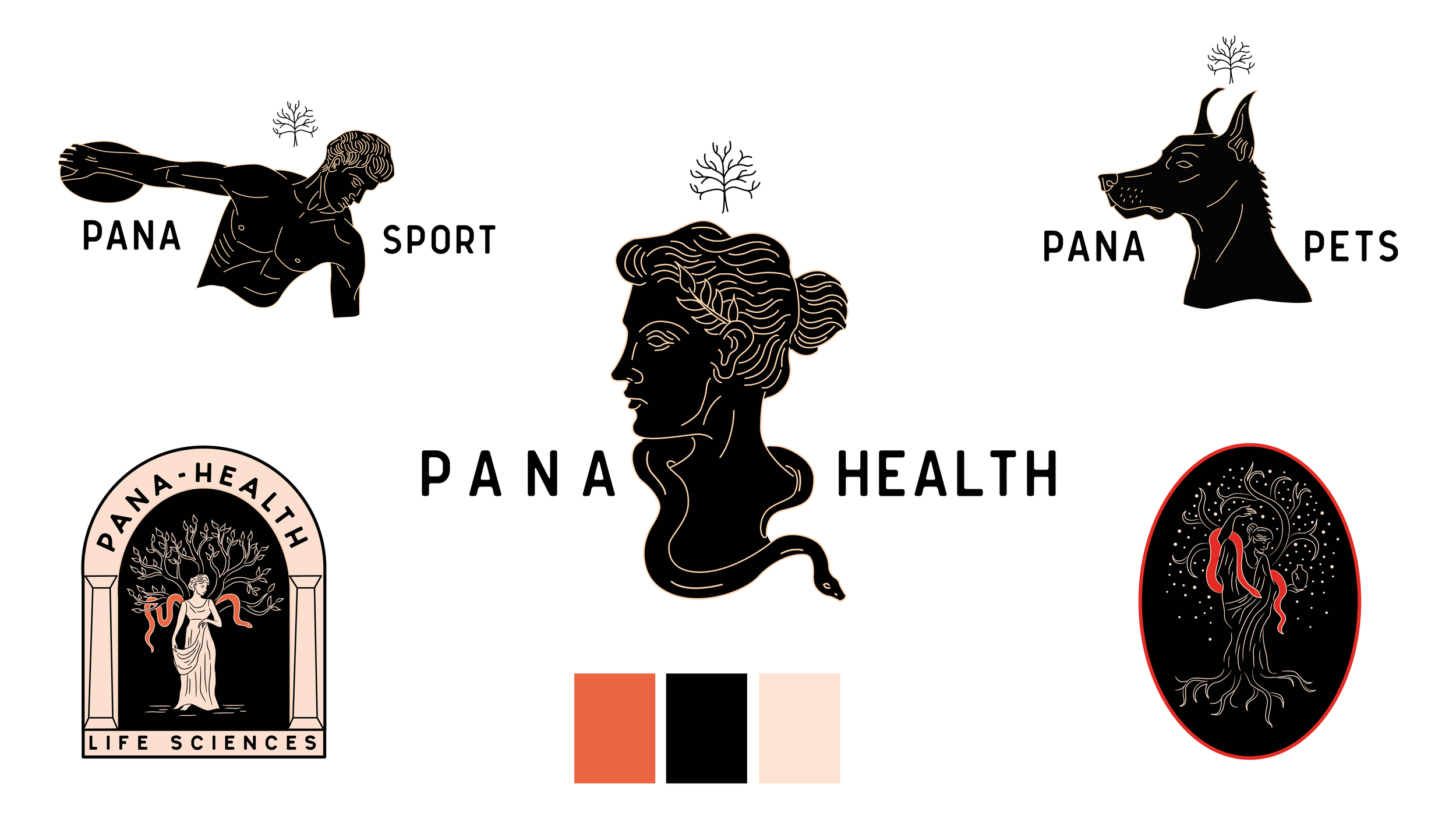
Logo Exploration
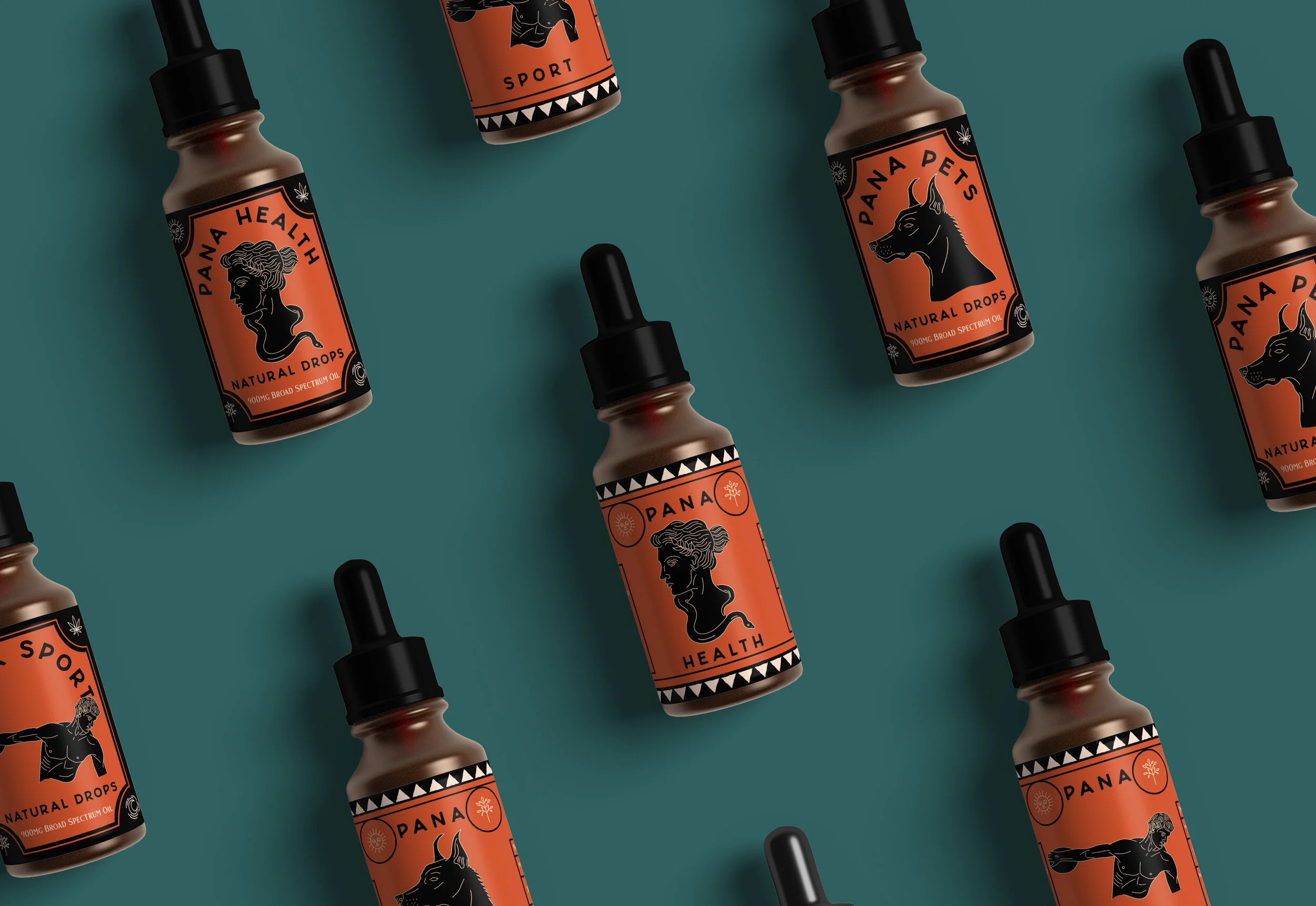
Packaging
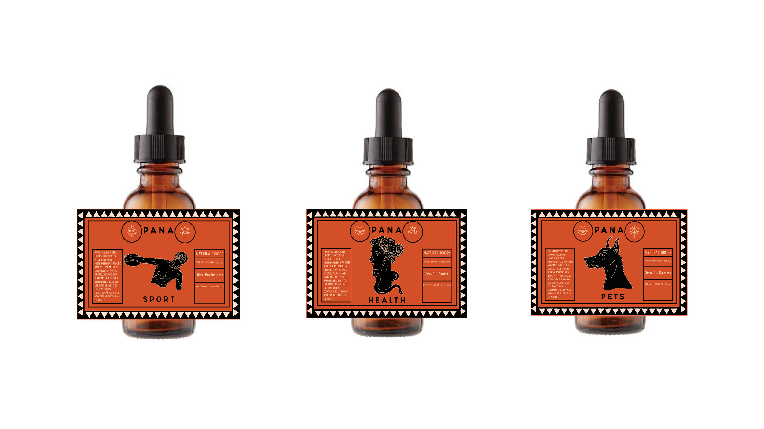
CBD tincture label designs
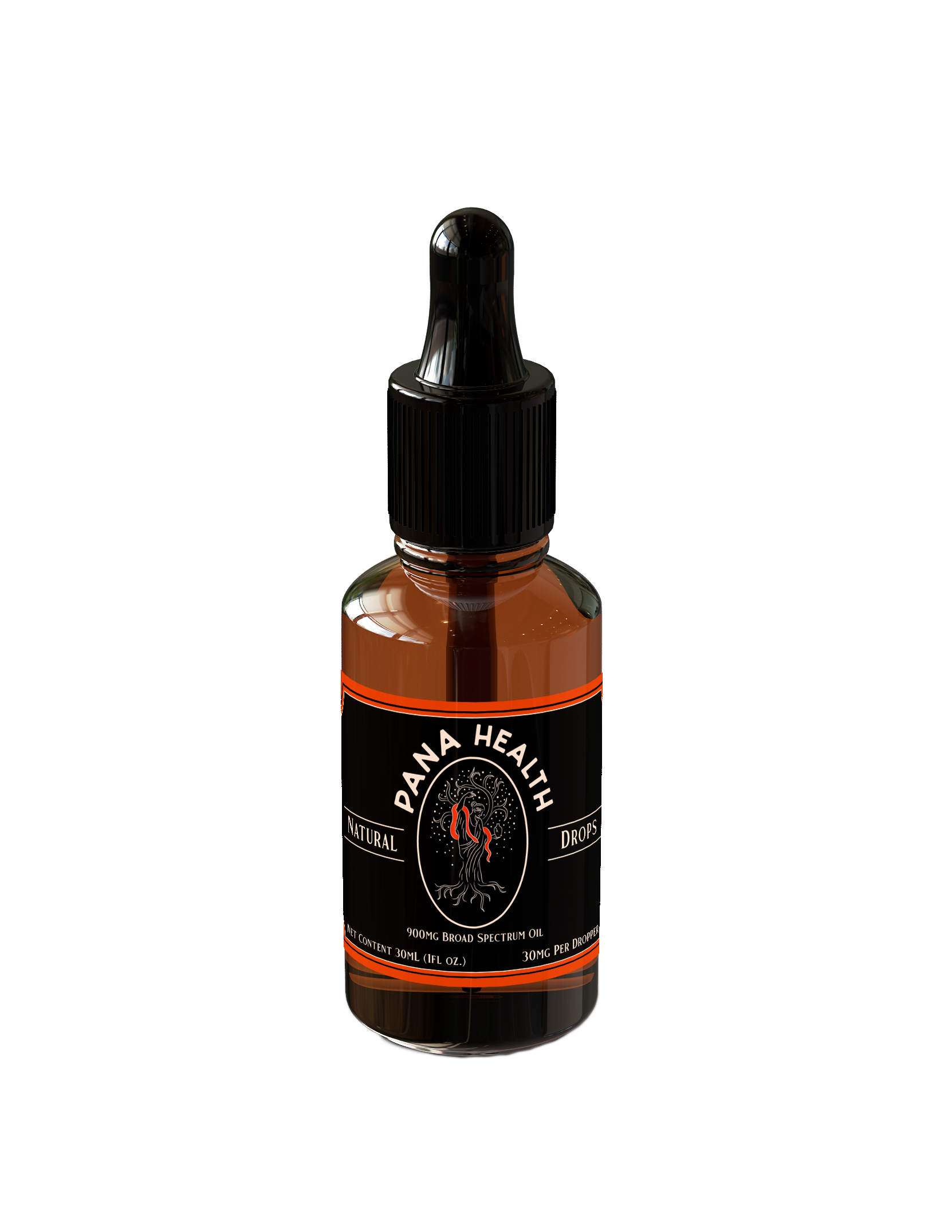
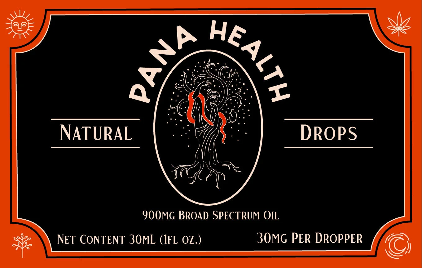
Label Designs